What If Bike Paths Looked Like Subway Maps?

Think maps of bicycle lanes are too complicated? This guy’s fixed it.
CityLab readers: Sometimes you scare us.
Not only are you intimidatingly smart, many of you are professional experts in the topics we try to cover. Others are self-taught aficionados in urban planning or cartography—in other words, obsessive city-stuff superfans.
That may be the case with Michael Graham, who sent CityLab an actual snail-mail letter a few weeks back with a QR code linking us to his Spider Bike Maps page.
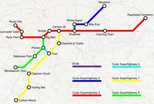
His cool idea: Make maps for bike infrastructure as if the lanes, trails, and paths constituted a connected transit system.
Graham became fascinated with London’s bus maps on a family vacation there in 2004. The bus route diagrams in London are sometimes referred to as “spider maps” and they are designed to help make bus routes as intuitive as the lines of the London Underground for the people that use them.
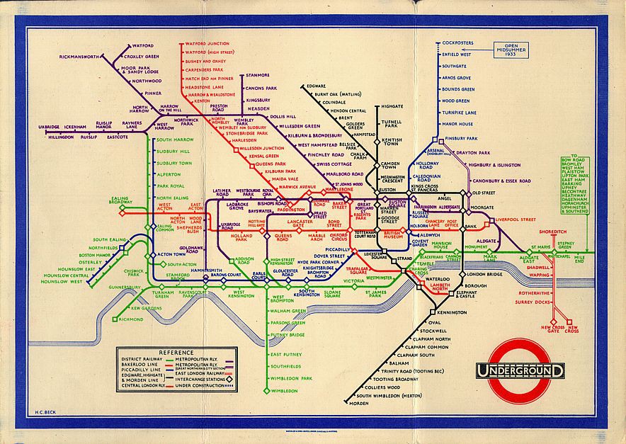
Later on, Graham learned all about Harry Beck, the draftsman who broke from geographic fidelity to devise a stylized map for the London Underground. Beck drew inspiration from an electrical schematic to create the prototypical transit map for the system in 1931. He used colors to represent different subway lines and made the lines intersect at either 45 or 90 degree angles. “The map of almost every subway system in the world has converged upon some approximation of Beck’s design,” Graham says. “I think people appreciate the simplicity; it makes complex information easier to understand.”
Graham says the idea for bicycle spider maps came to him later, when he started working at a small financial regulatory agency near Washington, D.C., in 2008. His commute from southwest D.C. to McLean, Virginia, required numerous Metro and bus transfers. He realized he could switch to cycling when he found that bike pathscovered almost the entire route to work. “I thought to myself,” Graham says. “I am a cycling enthusiast, and it took me too long to discover the bike routes near my home and office. What about the average person?”
Graham was struck by how much easier it was to use the H Street bus spider map compared to the information-dense cycling map of Washington.

“Most urban bike maps are extremely detailed,” Graham says. “I love them, but I’m afraid the average person might find those maps overwhelming and inaccessible.”
He was also struck by a Wonkblog post that detailed the disconnectedness of city bike lanes. (Density is also important.) So Graham attended a Transit Tech workshop in Arlington, Virginia, hosted by Mobility Lab, taught himself to use Adobe Illustrator, and tasked himself with applying these concepts to bike maps for four cities: London, San Francisco, his hometown of Denver, and Washington, D.C.
He was also struck by a Wonkblog post that detailed the disconnectedness of city bike lanes. (Density is also important.) So Graham attended a Transit Tech workshop in Arlington, Virginia, hosted by Mobility Lab, taught himself to use Adobe Illustrator, and tasked himself with applying these concepts to bike maps for four cities: London, San Francisco, his hometown of Denver, and Washington, D.C.
To make these maps, Graham printed a Google Map with bike trails, traced the bike paths with a marker, picked landmarks along the way to use as subway-style stations, photographed it with his cellphone, and used that as the base layer for the digital map. He then substituted it with an OpenStreetMap for the final product.
This process produced the maps on right side of the slide tools below, which adhere to the trails with geographic fidelity. But he also made more conventional subway-style maps, which you’ll see on the left side of the slider.
Comments
Post a Comment